|
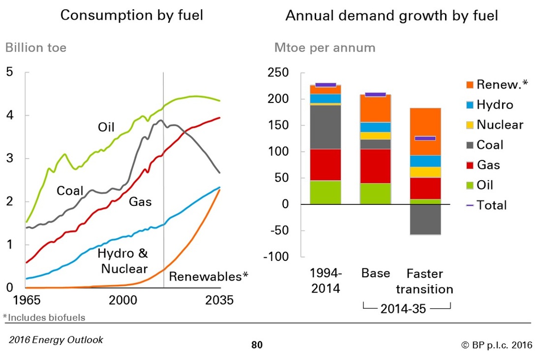
The chart above is from the BP World Energy Outlook 2016. It's the most dramatic decarbonisation scenario of three scenarios they forecast through to 2035. It sees global carbon emissions (from the global energy system) peaking in about 2020 (roughly coinciding with peak oil). To the left of the thin grey vertical line are the actuals from 1965 to 2014. BP admits in their analysis that even this aggressive decarbonisation scenario does not achieve the IEA 450 (ie warming kept under 2 degrees) scenario. All BP's scenarios fail to meet that target. However, I think there are two remarkable things about this chart.
The first is that it shows that, for anyone planning for future investment in long-term energy infrastructure (for which there can be forty-year timeframes and Net Present Value calculations), it is no longer Business As Usual. The renewables energy revolution has already started. The second is that gas is clearly considered a growing fuel for a long time to come. I hope that includes effective CCS. As a final consideration, BP's forecasting models the total energy demand based on various assumptions about GDP and population growth (among other things). One way of moving closer to achievement of IEA 450 would be to influence energy demand so that future forecasts can be reduced. That would speed the demise of coal and could potentially reduce the forecast use of gas.
0 Comments
Leave a Reply. |
AuthorThe Planetary CFO - working towards a sustainable World Balance Sheet. Categories
All
Archives
July 2024
|

